
X-Men
Poster Analysis
Introduction
I confess I had absolutely no idea who the X-Men were before the release of this film as I was aware of comics but never truly did read them at the time. At the time there weren’t any true comic book stores anywhere near the place I lived while bookstores only sold German comics alongside Mangas. It was quite a strange time that has come to change in recent years as more and more comic book stores seemed to have popped up after I moved away from Vienna, just my luck. Still, with the surge of comic book movies this has pushed them into the foreground and stores seem to at least stock up on the biggest names in comic books. X-Men alongside Spider-Man was one of the comics that started a Renaissance for this genre of films and it is fascinating to see how it has changed not only the entire playing field but also the world around us, especially that specific market. So, once again going back around a decade let’s take a look at the posters for the first X-Men film back in 2000.
Analysis
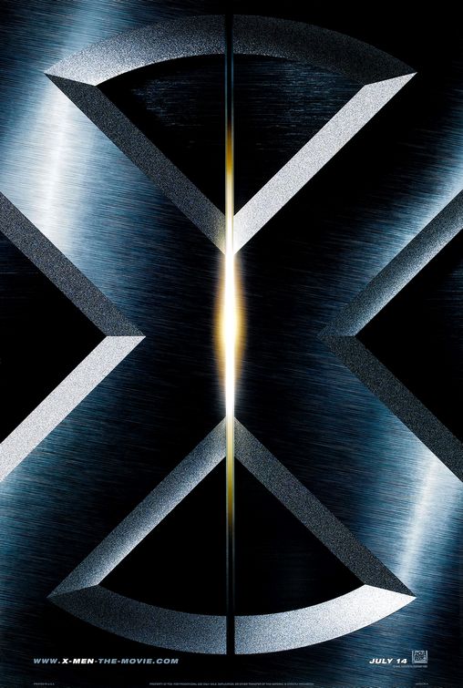 So from a person who has no true experience with X-Men at the time I’ll take it from that exact perspective, the everyday moviegoer. All I have to go by is a quite interesting name that seems to reflect the X Generation maybe in a way. In front of me I have a giant poster featuring what seems to be a door slowly opening. Quite impressive is how gigantic this X must symbolize something grand to come. Yet I have no true idea what it stands for except I could interpret it in different ways. Maybe this is a very futuristic film going into the future were humans have developed into completely different beings. However it could also tell me a bit about an own race of developed humans that live among us. This door could show us that they are hiding whom they truly are. From the size of the door it seems for the purpose to protect themselves and those around them. Yet with this film that door will open and allow us, regular humans, to enter a world that we may have never even dreamt of.
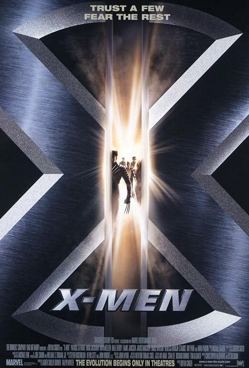 Finally we are getting our first but small look at what these people are. While it still does not give us an answer to what type of people they are. Yet what we do get to see is quite interesting as the most prominent is the man with three claws coming straight out of his hands. One could see that even with this strange thing coming out of his hands, he still seems human. Are they truly from the future or simple mutations? We also get our first look at the tagline stating that we can “Trust a Few, Fear the Rest”. That pushes forward the thought that these people are maybe a completely different race and while the people we follow may be trustworthy others would kill us in an instant. This film will feature some kind of uprising or revolution of people that have been treated terrible. Maybe we are at fault for forcing some them to use violence to take back their rights. Yet whatever may come there are still some people fighting on our side.
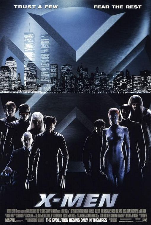 The film loves putting these characters into the shadow, but one thing is apparent that each one of these characters are unique. While in the last time a man with claws was pushed into the foreground he still is shown as the frontrunner for his team. We do know that he is probably a part of the good guys especially with realizing that the one-and-only Patrick Stewart is trapped in a wheelchair. Maybe he was affected by some horrible incident that put him into that position. We also get our first look at the villains with a mysterious woman in blue, which also seems to be a naked. Now, to stop the charade as if I had no idea who these characters are I must say the poster is effective but does have one fault, it is misleading. Looking at this poster without any idea who they are I would believe that the leader of each team is Wolverine and Mystique, which I find a bit strange that makes sense when one considers how much they are front in center throughout the film. Only issue is that we don’t really have Magneto or Professor X, the actual main focus, anywhere in the front.
 I do find the idea of this one interesting. While it is an easy way to highlight the extensive cast for the film it sadly suffers from a small issue as it is a bit confusing if this is the first poster one sees, as you have no idea who is on whose side. Wolverine is thrown at the bottom alongside Mystique while Toad is on top with Storm. Still with the “I have no idea who the X-Men are” mindset it would confuse me as soon as I watch the movie why they are on different sides of the conflict. I do love the way they highlight certain aspects of characters though. Wolverine with his famous claws is a great image as is Cyclops eye blast. Some characters work a bit better than others especially due to the blue colors but it is a nice approach
Conclusion
While I do like these posters I have come to realize how different this type of medium is handled nowadays and around that time. Alongside Spider-Man there are only a real handful of posters to find, as it seemed their own tagline was “less is more”. Today we are almost flooded with a variety of posters that it is understandable that one would get confused on which belongs to what film. Still, it is interesting to see how this has changed over the years and it may show that at the time there wasn’t a lot of trust for comic book movies to become the box office draw they are today. For the time these posters are quite interesting, especially with the more futuristic design. While I do find some of them a little misleading the original release works quite well to build up the mystery to who these characters are.
NEXT TIME a non-comic book movie
DRINING DURING THE APOKALYPSE
So, what do you think of the posters? What are your personal favorites? Did I maybe miss any, then don’t hesitate and send them to me on Facebook!
